Bauhaus Magazine
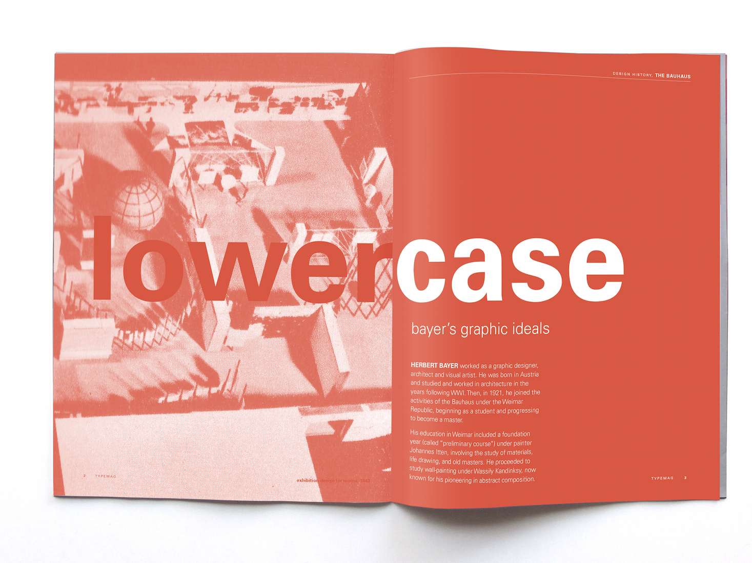
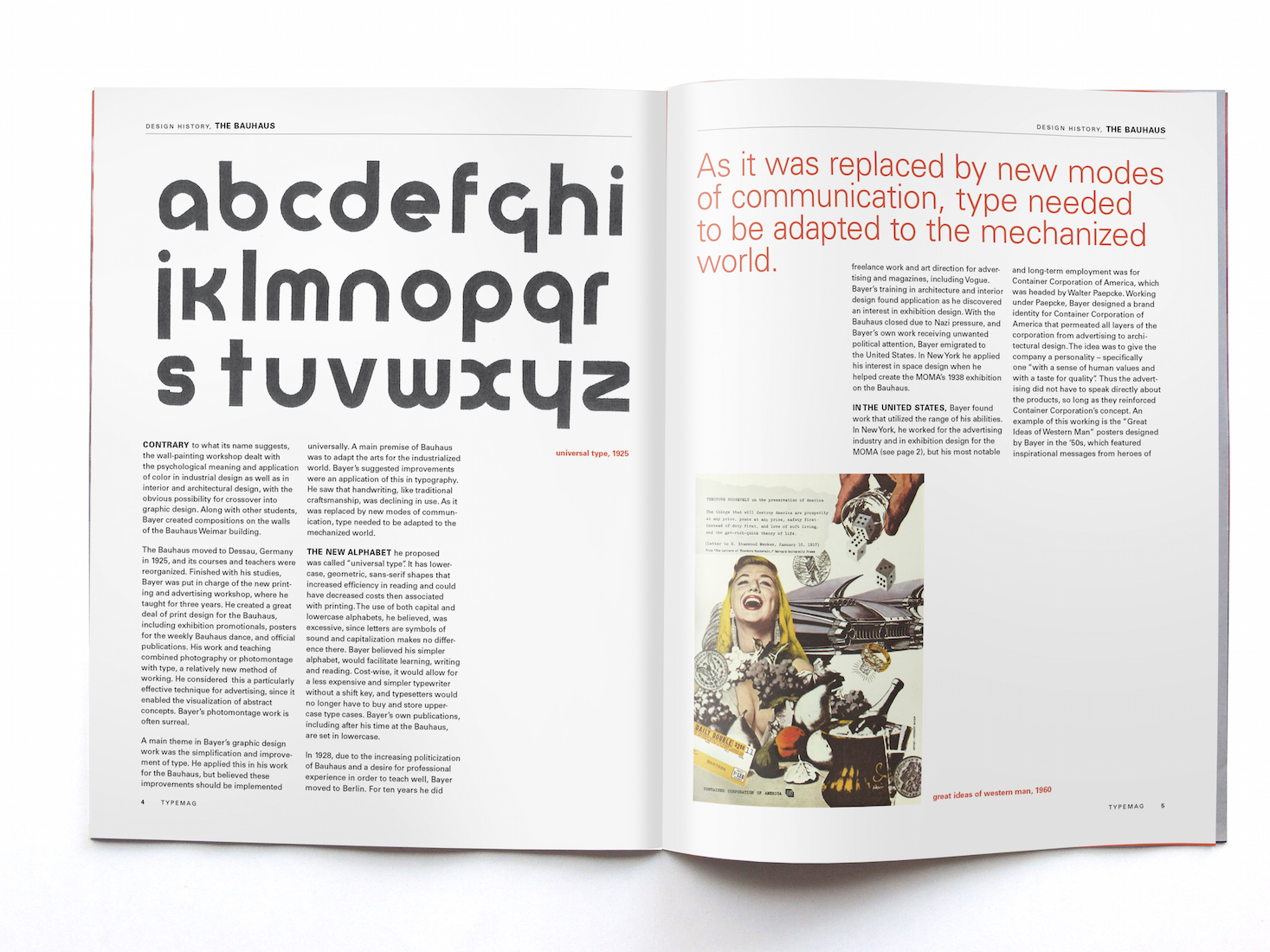
These magazine spreads demonstrate layout on a grid. Aesthetically, the article's design is inspired by Herbert Bayer, the subject of the text. The lowercase title and captions are a nod to his vendetta against capitals. The monochromatic color scheme is also inspired by his use of simple colors and shapes.


